An Uxeria study shows that 70 percent of failed online businesses do so because of poor user experiences. This means that most brands’ online business, and ultimately maximizing their e-commerce potential, falters simply from an affliction that they might not even be fully aware of. Few clear metrics will show you that you suffer from a bad user interface (UI) or user experience (UX), but your bottom line will surely take a hit because of it.
By the same token, businesses that have great UX and UI might not be able to directly tie their success to their Web design. However, it’s clear that UI and UX are essential components of any top-tier e-commerce company. And while you might not be competing with these upper-echelon businesses just yet, you can still learn the building blocks of Web design from those that do it best.
Here’s a look at five of the best examples of UX and UI that the Web has to offer. Learn from the experts and see what you can incorporate into your design.
Airbnb
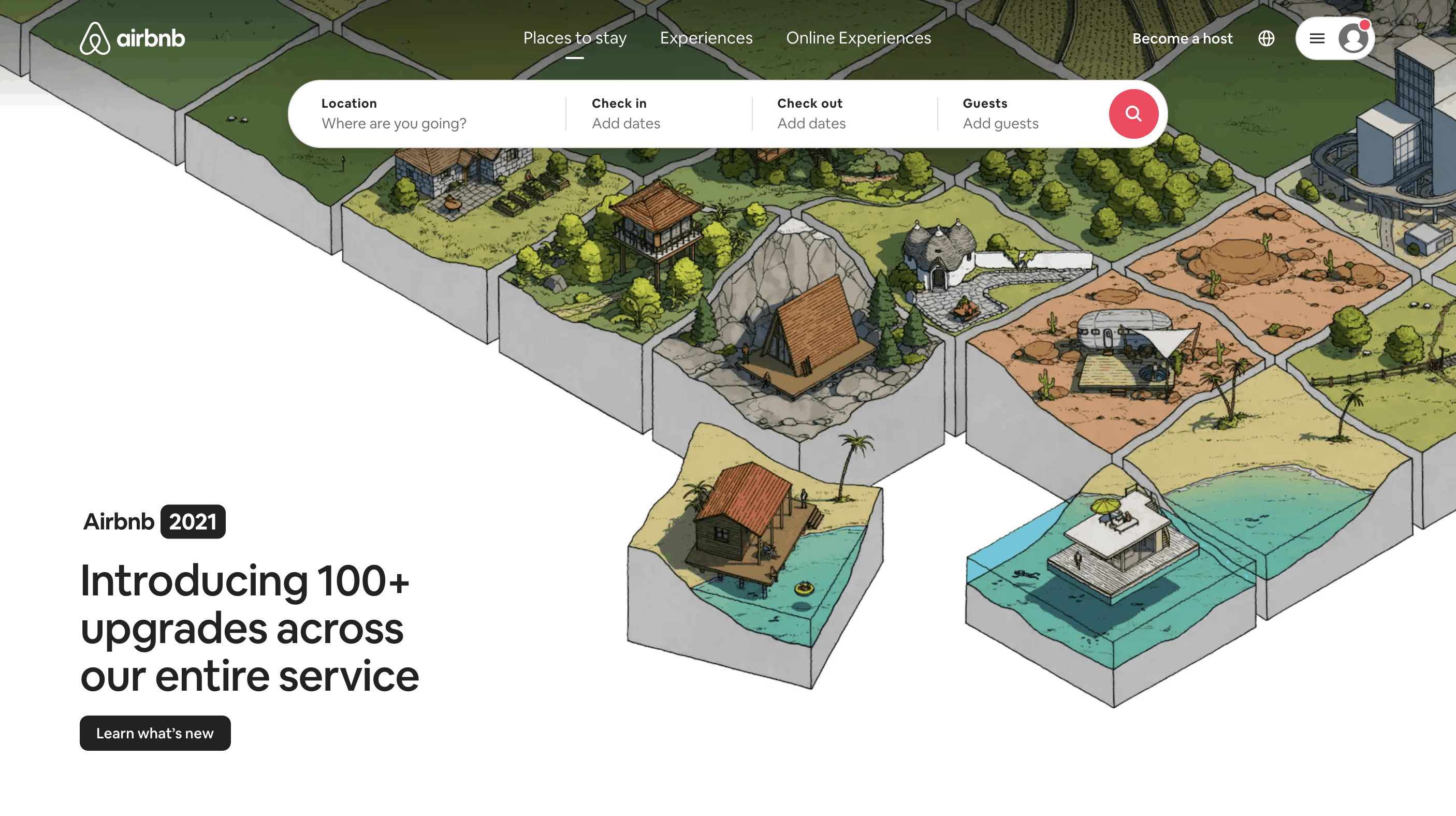
If you’ve gone on vacation in recent years, odds are good that you’ve checked out Airbnb’s website along the way. It’s a potential money save, and it can change the entire itinerary of your vacation. But it’s also a technical marvel that streamlines functionality for both the property owner and the renter.
One of the best things about Airbnb’s website goes well beyond simply listing properties. Instead of simply giving a location and some pictures, Airbnb sells the user on a potential vacation by highlighting things to do in the area. This helps potential customers to really visualize their vacation, which gets them excited about renting through Airbnb. It also eliminates a lot of the research that’s typically done on other sites — and the UI and UX of those sites might be subpar, convincing those individuals to abandon their plans entirely. By keeping virtually the entire funnel in-house, Airbnb is able to more easily convert while also making life easier for renters.
A major technical challenge for Airbnb is representing thousands of rental properties, all under one banner. At the same time, Airbnb must ensure the security of property owners while simultaneously giving renters peace of mind. This is all part of Airbnb’s layout, which conveys simplicity and safety, all while providing a modern and clean interface that makes it easy for renters to make reservations.
For a company like Airbnb, the most valuable piece of real estate isn’t a rental property — it’s their website. The care and attention placed on UI and UX is what has kept Airbnb an industry leader for years.
Medium
Some websites sell nothing besides the content that’s present on the site. That’s the case for Medium, a popular blogging site used by thought leaders and upstart writers alike. One of the reasons it’s so popular is directly related to its interface.
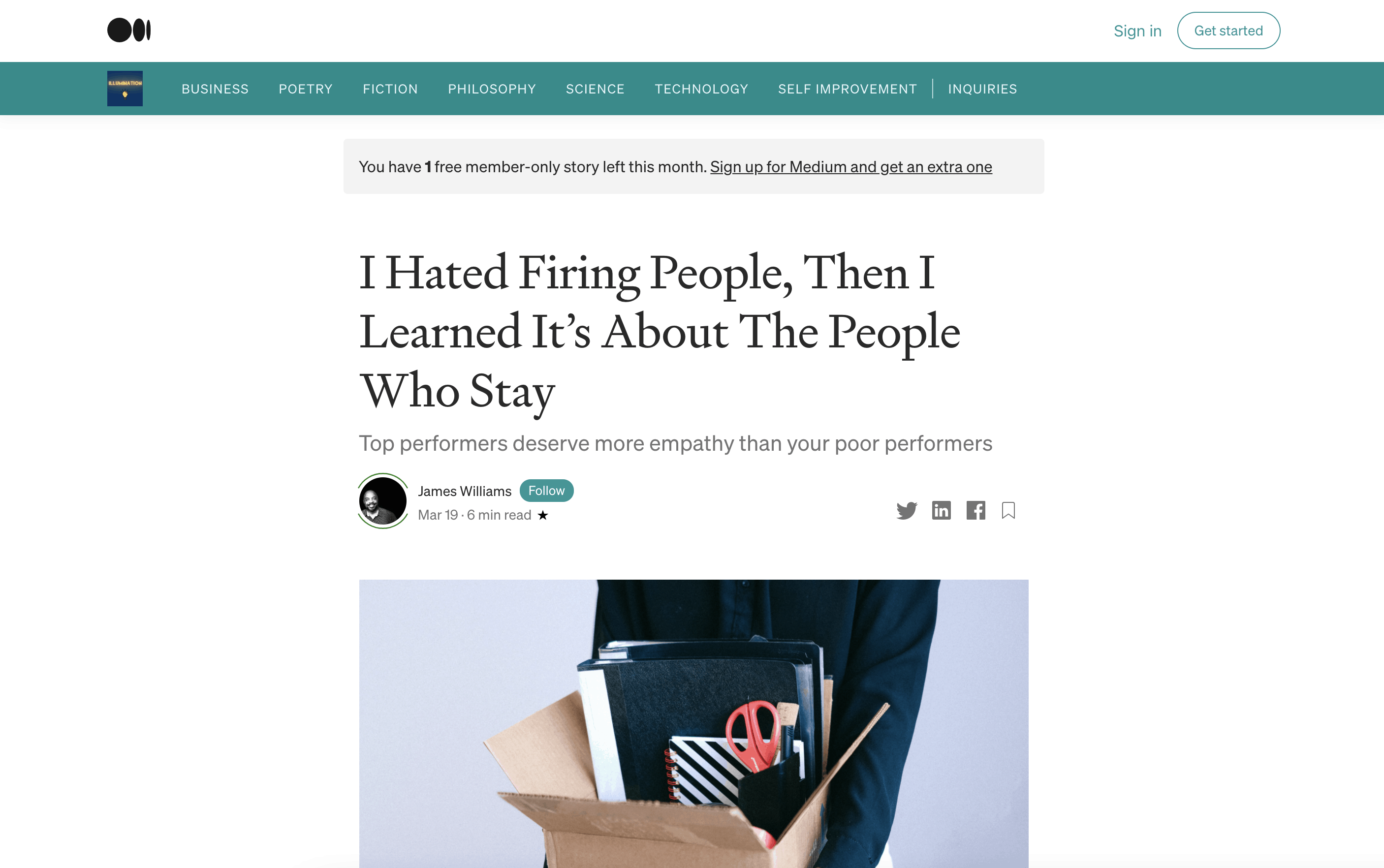
Unlike most other sites that host written content, Medium isn’t completely slathered with ads. No garish image ads on the sides of articles; no pop-ups that cover entire paragraphs. Instead, there’s plenty of white space, which makes for a great reading experience. It’s the closest thing on the Web to reading a book. With the focus on the content itself and not the bells and whistles surrounding it, the viewer is welcome to fully engage themselves in the words and have a deeper experience with what they’re reading.
Medium also excels in not only meeting reader expectations, but exceeding them. Medium was among the first sites to include how long it will take to read a particular article. This helps readers to know exactly how much time they need to invest in a given piece. There’s also a seamless transition between the desktop version of Medium’s site and their mobile page. These aren’t musts, but they go a long way toward visitor satisfaction.
As a whole, Medium offers a premium reading experience that mirrors that of major newspapers. However, in this case, the content is tailored to the reader’s preferences, and the distractions are all but eliminated.
Duolingo
Learning a new language is incredibly intimidating. Many people would simply assume it’s too difficult and give up before they even start. Duolingo, however, dissuades people from taking that stance, and it does so through a clever UX and a well-constructed UI.
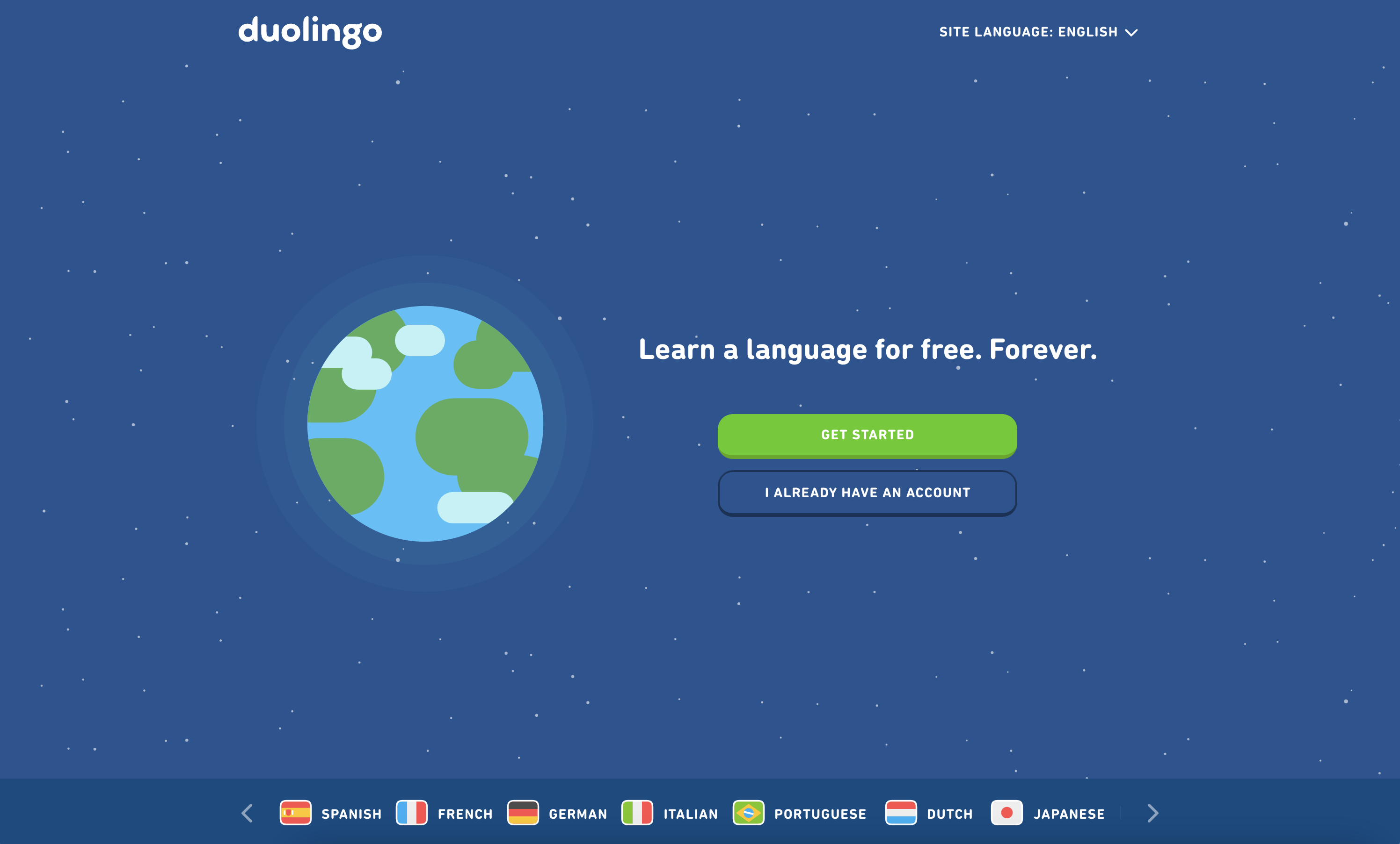
Duolingo knows that its core audience has been through traditional school and has no desire to go back. To counter this mentality, Duolingo uses its website to present the company as a fun and clever alternative to what one might consider learning a second language to be like. The site incorporates lots of personality, most notably through Duo, the site mascot. Duo helps to keep things light and enjoyable, helping people to truly have fun while they learn.
Anyone who has attempted to switch languages on an e-commerce site knows the difficulties that one can experience while navigating through prompts. Duolingo makes it easy for users to not only see different languages, but to learn them as well. A simple yet sleek layout makes for a great user experience that keeps people coming back.
Netflix
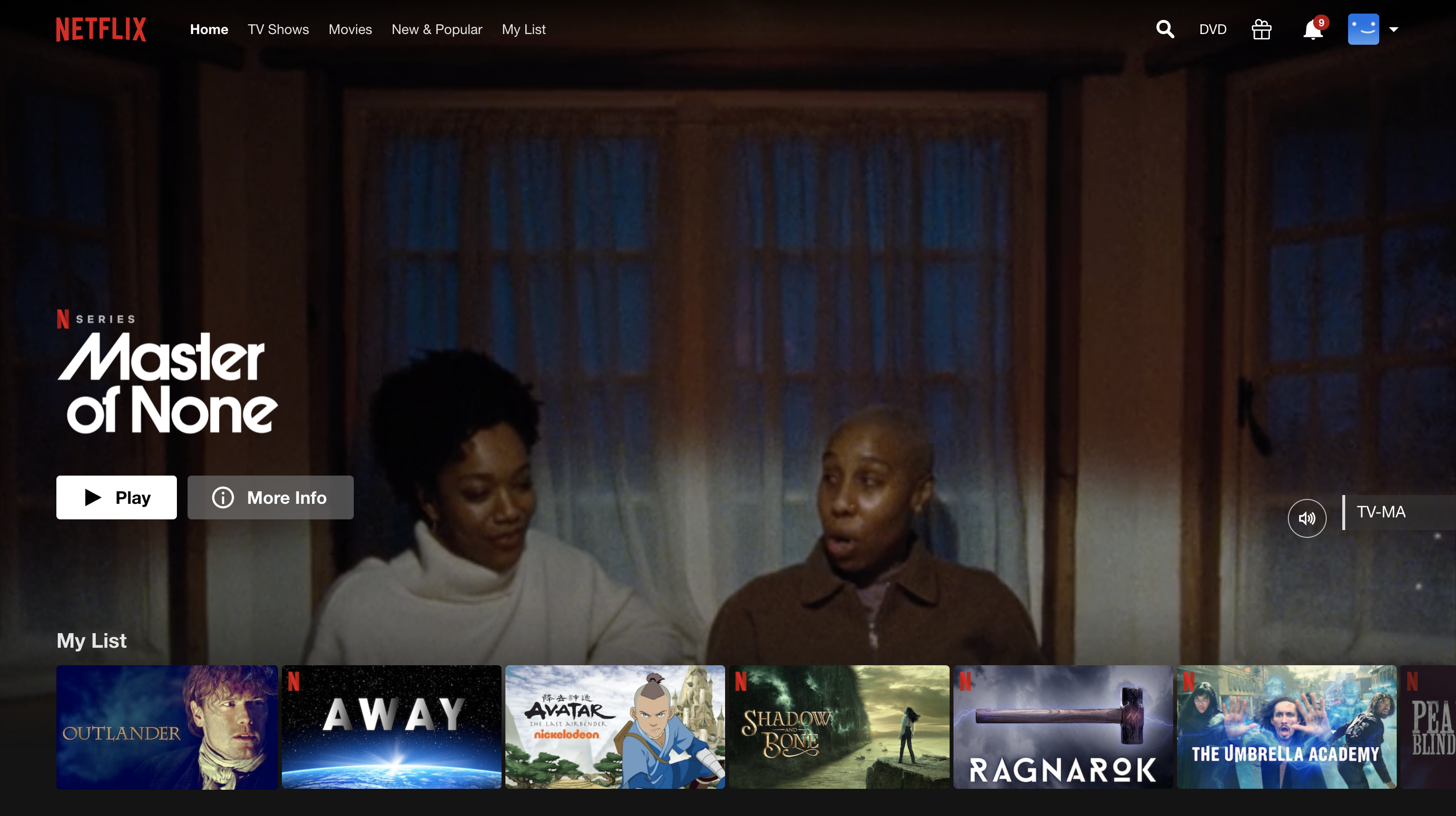
Netflix is such a ubiquitous part of our culture that we almost take for granted how seamless an experience it is. It wasn’t so long ago that watching movies from home required us to go to the store or to receive DVDs by mail. Now, it’s easy, and we have Netflix to thank for that.
Through Netflix, you barely have to think about what you want to watch. Hover over a square on your display, and you’ll see a preview for the movie or show. Click on the name of that item, and it starts playing right away, without having to repeatedly press Play. This is all done very smoothly and with no hiccups. Netflix also manages the user experience by well-placed prompts asking users if they’re still watching as well as leaving half-watched shows paused for future resumption.
What’s the difference between Netflix and competing streaming sites, you ask? Most other platforms simply haven’t figured out the UI UX component. Amazon Prime Video, for example, is slower to load and features inconsistencies across some platforms, meaning that the user experience is inherently compromised.
But that’s not all. Due to the nature of Amazon’s platform, some options are free to watch, and others require a purchase — but the site doesn’t make it entirely clear which are which.
Additionally, some thumbnails don’t display properly, and it’s even hard to find some items on your list of shows, even when you’ve purchased those shows and own them forever.
Similarly, Hulu features a clunky interface, including menus that are difficult to navigate and previews that take up the entire page. While it may have plenty of viewing options, it’s hard to find those items. Meanwhile, Netflix offers just as much, if not more, in a much more user-friendly interface.
Netflix has been the standard in streaming for a decade running now, and it shows no signs of slowing down. Much of the credit for its success goes to its convenient UI and UX across all platforms.

Video Game Weapon Wheel
UX and UI inspiration doesn’t just come from big-name companies — it can come from anywhere. And while the weapon wheel isn’t well-known outside of gaming circles, there’s a lot you can learn from this type of layout.
The weapon wheel is great in fast-paced games that require the player to navigate through several options quickly. One such example is Grand Theft Auto 5, in which players must rotate guns and ammo instantaneously. The reason why it works is that it’s an option that’s hidden until a certain button is pushed or held down, and it’s easy for the player to simply make their choice, release the button and put the weapon wheel aside.
It’s also a great tool for customizing UI to a particular platform. On a phone, for instance, a player can click on any item they want simply by touching a screen, so it’s easy for mobile users to make a choice. However, for someone using a controller or using any sort of remote control, navigational options are limited. The wheel allows a menu to quickly pop up and for users to cycle through as needed.
Most modern sites now incorporate a drawer, in which all options are hidden. However, as online functionality increases, so too do the number of options in that drawer. Suddenly, that neat drawer has become untidy. Options like a clickable wheel make it easier for marketers to provide a clean user interface.
Improving your user interface and user experience is a must-have in any marketing strategy. With such a premium on websites, particularly mobile sites, you can’t afford to settle for second best when it comes to UX and UI. If you’d like help with getting your site where it needs to be, contact us at Commit Agency today.


